1. Brand identity is more than a logo
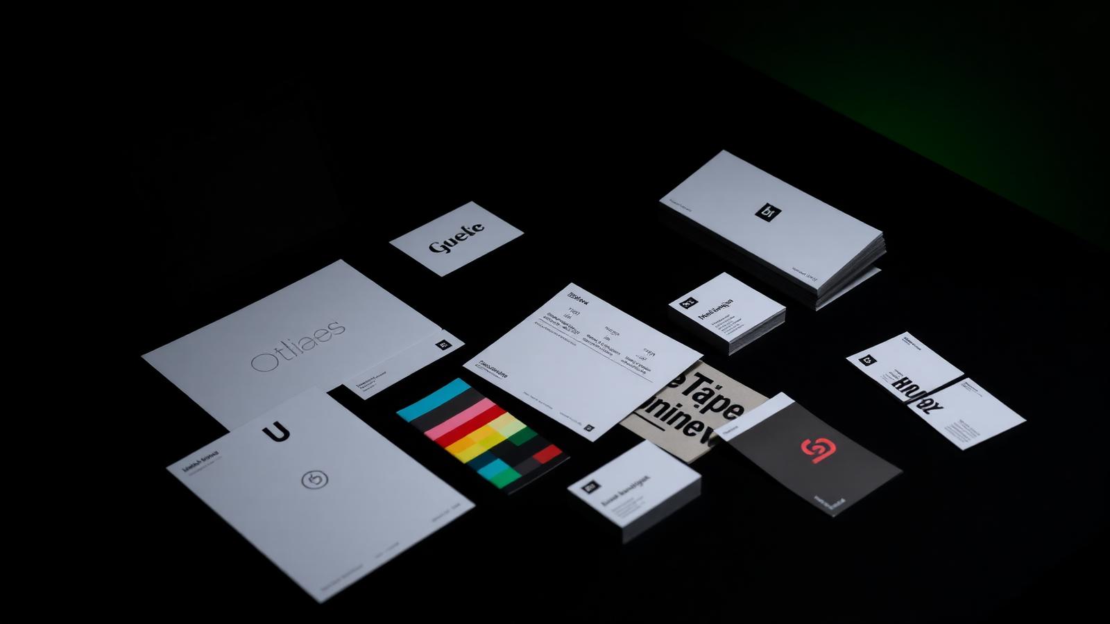
A brand identity is the complete system a business uses to present itself: logo and marks, colour palette, typography, imagery style, tone of voice, layout rules and the way all of it behaves across every channel. The logo is simply the signature on the end of that system.
In 2026, buyers make a credibility judgement within seconds of landing on a website, a social profile or a proposal. A coherent identity signals a business that is organised, established and safe to buy from — before a single word of your sales copy is read.
- Logo suite and responsive mark variations
- Colour palette with accessible contrast values
- Typography hierarchy for web and print
- Imagery, iconography and graphic language
- Tone of voice and messaging framework
- Templates for social, decks and documents
2. Strong identity buys trust you haven't earned yet
Most first impressions now happen without a conversation. Someone finds you through search, a referral link or a social post, and decides in a glance whether you look like the safe option. Inconsistent or dated branding quietly transfers that decision to a competitor.
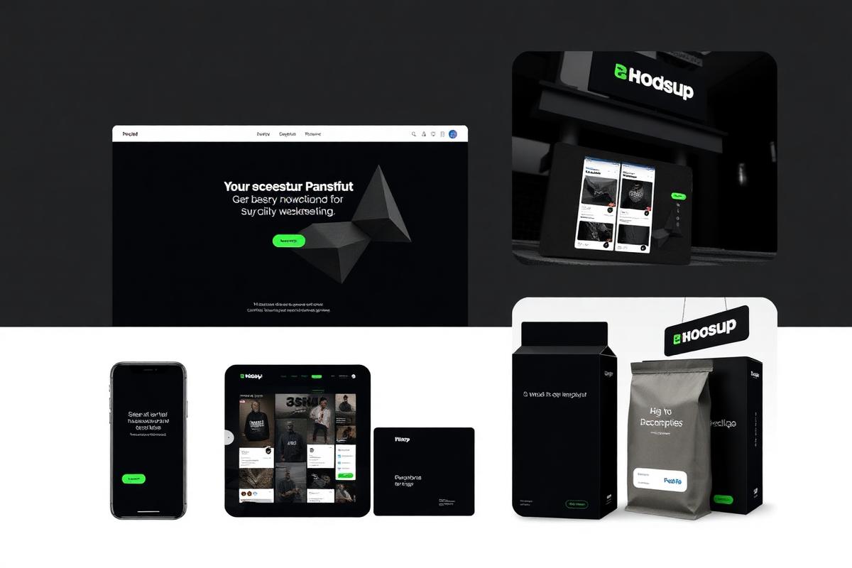
Consistency is the mechanism. When a prospect sees the same colours, typography and voice on your website, your LinkedIn, your invoice and your proposal, the brain reads it as reliability. That perceived reliability is what allows smaller businesses to compete with far bigger budgets.
3. Consistency compounds — inconsistency leaks money
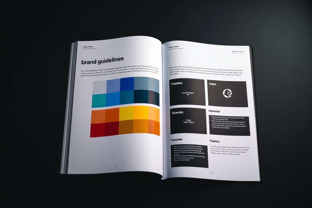
Every touchpoint either reinforces recognition or resets it. Businesses without documented brand guidelines end up with four shades of the same colour, three fonts and a logo that has been stretched by whoever needed it last. Each inconsistency costs a small amount of recall, and it compounds.
A guidelines document fixes this permanently. It gives your team, freelancers and agencies one source of truth, cuts design turnaround time, and means every new asset adds to brand equity rather than diluting it.
- Website and landing pages
- Social media profiles and content
- Proposals, decks and case studies
- Email signatures and newsletters
- Paid ad creative
- Signage, vehicles and print
4. Branding is a pricing lever, not a cost
Two businesses offering identical work rarely command identical fees. The one that looks and communicates like a category leader wins on perceived value and defends higher pricing — because the buyer is not just purchasing the service, they are purchasing confidence in the outcome.
That is why brand investment shows up in margin, not just marketing metrics. Stronger identity shortens sales cycles, reduces price objections and improves the quality of inbound enquiries.
5. Signs your brand needs a refresh in 2026
Rebranding for its own sake is waste. But there are clear, practical signals that an identity is holding a business back — and most companies recognise several of them immediately.
- Your logo doesn't work small, on dark, or on mobile
- Your website looks newer than everything else you produce
- You've outgrown the market you originally branded for
- Prospects misunderstand what you actually do
- Your team recreates assets from scratch every time
- Competitors look more established than you at a glance
6. How a brand identity project actually runs
A credible identity project starts with strategy, not sketches. We begin with discovery — values, positioning, audience and competitors — so the design solves a business problem rather than a taste preference.
From there: concept directions, design development into a cohesive system, collaborative refinement, and final delivery of every asset plus the guidelines that keep it consistent. Typical timelines run four to eight weeks depending on scope.
- Step 01 — Brand discovery and positioning
- Step 02 — Creative concept directions
- Step 03 — Design development into a system
- Step 04 — Revision and refinement
- Step 05 — Asset delivery and guidelines
7. Designing for a digital-first, AI-shaped 2026
Identities in 2026 have to survive dark mode, 32-pixel avatars, vertical video, AI-generated summaries and search results that show your brand without your website. That demands responsive logo variations, accessible colour contrast, and a tone of voice distinctive enough to survive being paraphrased by a machine.
Practical rule: design the smallest and darkest application first. If your mark reads clearly as a favicon on a dark UI, it will work everywhere else.